Grey card vs white paper for colour correction
Both give the camera a known neutral to correct white balance and brightness. White paper is free and good enough for everyday work; an 18% grey card is more consistent and clips less.
On this page
A phone photo only becomes a measurement when something of known colour is in the frame. White paper and an 18% grey card both do that job: they let software remove the light's tint (white balance) and set the brightness scale. White paper is free and good enough for everyday matching. A grey card is made to be neutral, varies less and is harder to overexpose, so it gives more consistent readings. A 24-patch colour chart goes further and corrects hue errors too.
What the reference actually corrects
A camera never knows what colour the light is. Under a warm bulb everything is recorded too yellow; in the shade of a north window, too blue. The camera guesses and corrects, but it guesses from the whole scene – a red dress fills the frame and the guess goes wrong.
A neutral reference removes the guess. If the paper or card should be neutral but the photo shows it slightly yellow, the whole photo can be scaled so that the reference comes out neutral again. Mathematically, each colour channel is multiplied by a gain:
gain = the reference's known brightness ÷ the reference's measured value in that channel
The same gains are applied to the fabric. Two things happen at once:
- White balance – the reference becomes neutral, so the light's tint is taken out of the fabric too.
- Brightness anchoring – because the reference's true lightness is known, the fabric's lightness is anchored as well. A dark navy is not reported lighter just because the camera brightened the scene.
This only works if the maths runs on linear light values, not on the gamma-encoded numbers in a JPEG, and if the reference is lit exactly like the fabric.
White paper
Pros
- Always at hand, costs nothing.
- Bright, so the correction is based on a strong signal.
- Good enough to identify a shade and choose a first recipe.
Cons
- Not a standard. Papers differ slightly in tint – some cool, some cream.
- Optical brighteners. Many office papers contain them. They glow bluish in daylight with UV, which can nudge the correction.
- Easy to overexpose. Being close to white, paper can burn out in bright light, especially if the camera exposes for a dark fabric.
- Gets dirty and curls. A grubby or curled sheet corrects with the wrong answer.
Using it well: use plain, matt, bright white paper, the same brand every time, flat and clean. Keep it in the same light as the fabric, touching it.
18% grey card
An 18% grey card reflects about 18% of the light – a mid-grey with CIELAB lightness close to 50. Photographic grey cards are manufactured to be spectrally neutral.
Pros
- Made to be neutral, so the reference itself is not a variable.
- Mid-tone, so it sits comfortably in the camera's range and rarely clips, even next to a pale fabric.
- Repeatable – every capture corrects against the same thing, which matters when a target and its dips are measured on different days.
Cons
- Has to be bought (from camera or photo suppliers).
- Lower signal than white; in very dim light noise matters more.
- Must be kept clean and flat; a scratched or faded card should be replaced.
24-patch colour chart
A ColorChecker-type chart carries 24 patches of known colour, including neutrals and saturated colours. Software reads all of them and fits a colour-correction matrix, which corrects not only tint and brightness but also the camera's hue errors. It is the most complete correction a camera photo can get – but it has to be aligned carefully, kept flat and free of glare, and it costs more.
Common mistakes with either reference
- Reference in a different light. Paper in a patch of sun while the fabric is in shade corrects for the wrong light. Keep it touching the fabric.
- Reference tilted towards the window. It catches a reflection and reads brighter than it is.
- Shadow of the phone or hand across the reference or the fabric.
- Dirty or creased reference. Fingerprints, dye splashes and folds change what the camera sees.
- Coloured or cream paper. It shifts every reading in the opposite direction.
- Changing references mid-job. Measuring the target with paper and the dip with a grey card adds a difference that is not in the cloth.
Side by side
| White paper | 18% grey card | 24-patch chart | |
|---|---|---|---|
| Cost | Free | Low | Higher |
| Corrects tint and brightness | Yes | Yes | Yes |
| Corrects hue errors | No | No | Yes |
| Consistency between sheets | Varies | High | High |
| Risk of overexposure | Higher | Low | Low |
| Ease of use | Easiest | Easy | Needs alignment |
How Shadecard uses them
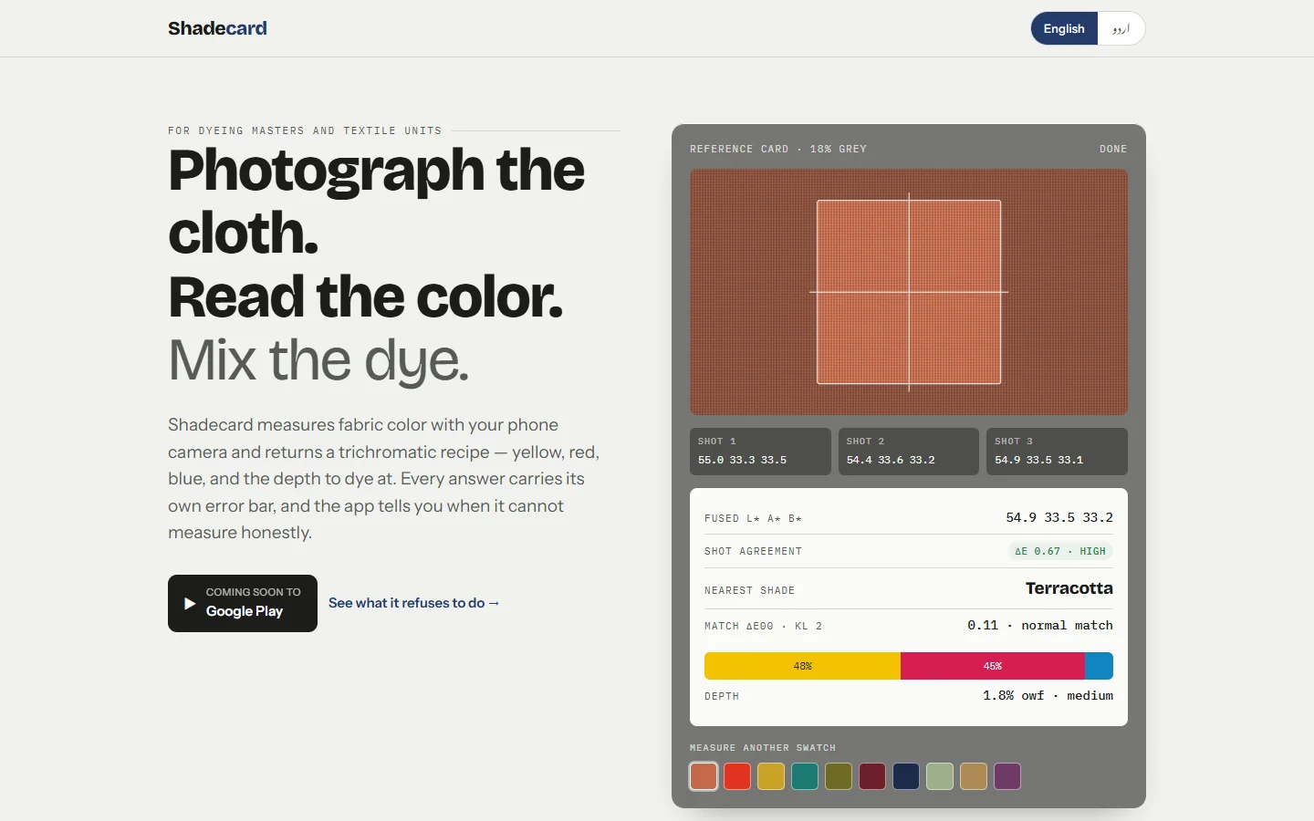
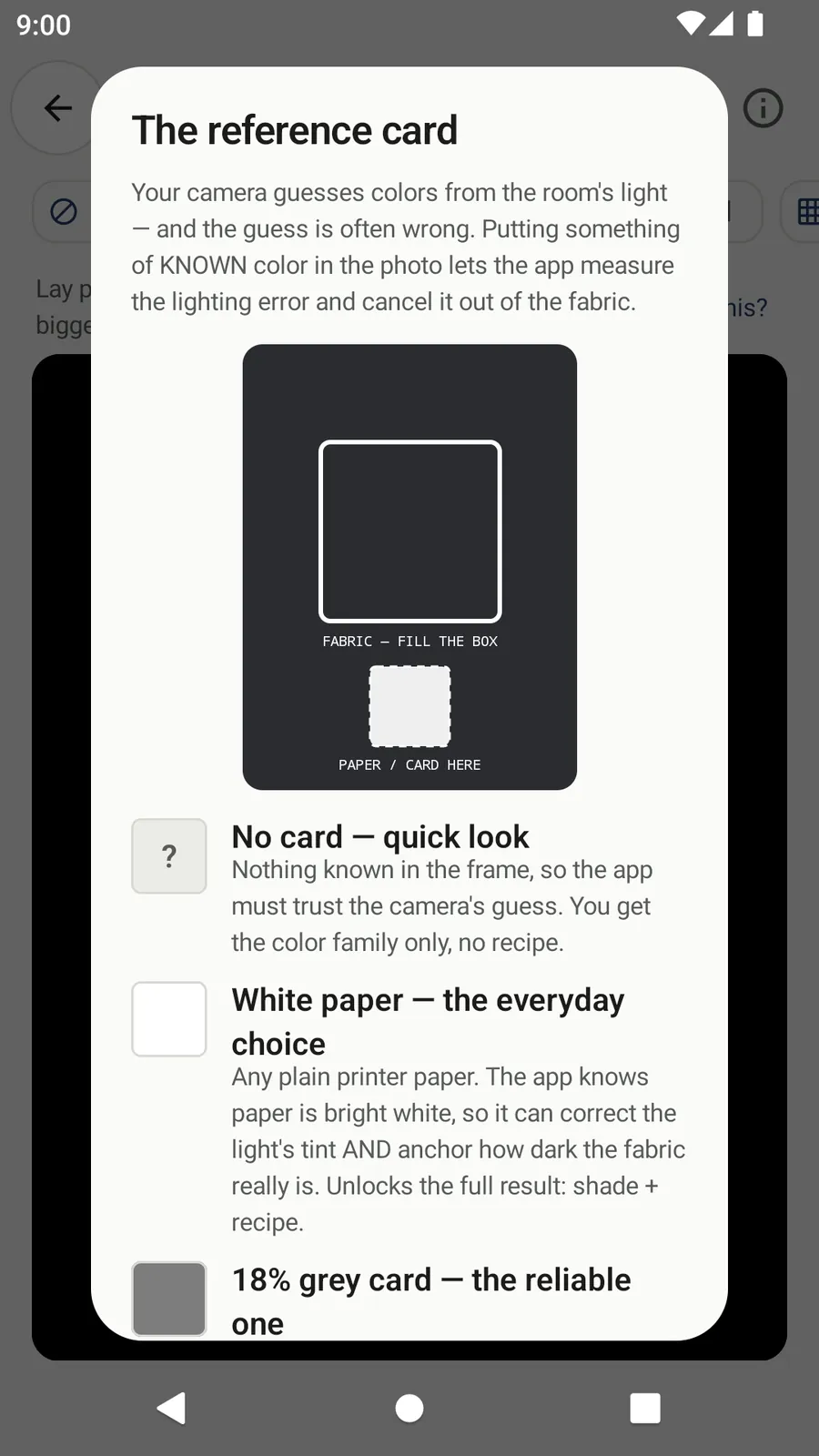
Shadecard's capture screen has four chips: No card, White paper (the default), 18% grey card and Color chart. You place paper or card in the small dashed box beside the fabric box; the chart goes in a wide grid box.
- With White paper the app treats the sheet as bright white; with the grey card, as an 18% neutral. Either unlocks the full result: shade and recipe.
- With Color chart it fits a full correction and reports how well the chart fitted.
- With No card it trusts the camera's own guess and gives the colour family only – never a recipe.
- If the reference is overexposed in two of the three photos, the capture is rejected with advice to move out of direct light.
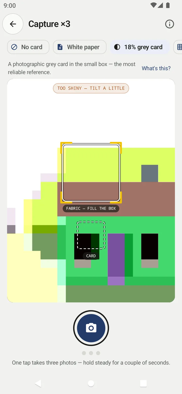
How to use each in the app: White paper, grey card or colour chart?.
Which should you use?
- Start with white paper. It is the everyday choice and good enough for a first recipe.
- Move to a grey card when you need readings to be comparable – across days, across staff, across phones.
- Use a chart when you need the tightest correction a phone can give.
Whatever you choose, keep it in the same light as the fabric, keep it clean, and keep using the same one. For the rest of the capture routine, see How to match a fabric colour with your phone camera.
Frequently asked questions
Why is it called an 18% grey card?
It reflects about 18% of the light falling on it, which sits in the middle of the lightness scale (CIELAB L* close to 50). Photographers use it as a standard mid-tone for exposure and white balance.
Can any white paper be used for colour correction?
Plain, matt, bright white paper works for everyday matching. Papers differ in tint, and many office papers contain optical brighteners, so use the same kind every time and replace it when it gets dirty.
Is a grey card better than white paper?
For consistency, yes: it is made to be neutral and is less likely to be overexposed. For convenience, white paper wins, and it is good enough for a first recipe.
What does a colour chart add?
A 24-patch chart has many known colours, so software can correct hue errors across the whole range, not just the overall tint and brightness.
Was this post helpful?