White paper, grey card or colour chart? Choosing a reference
In short
White paper is the everyday reference and unlocks shade plus recipe. An 18% grey card is more reliable. A 24-patch colour chart gives full colour correction. No card: family only.
On this page
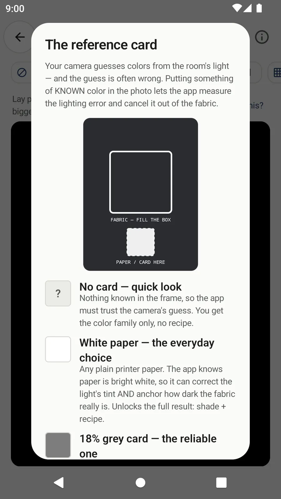
Pick the reference with the chips at the top of Capture ×3. White paper is the default and the everyday choice: it unlocks the full result, shade plus recipe. An 18% grey card does the same job with a more reliable, guaranteed-neutral surface. A Color chart (24-patch ColorChecker-class) corrects tint, exposure and hue at once. No card gives the colour family only, never a recipe.
Why a reference is needed at all
A phone camera decides colours from the room's light, and its guess is often wrong: the same cloth can come out warmer under a bulb and bluer in shade. Putting something of known colour in the photo lets Shadecard measure that lighting error and remove it from the fabric reading. The app's own help calls this the single biggest accuracy boost.
The four options
| Chip | What goes in the frame | What the app can do |
|---|---|---|
| No card | Nothing | Colour family only – no shade name, no recipe |
| White paper | Plain printer paper in the small dashed box | Corrects the light's tint and anchors how dark the fabric really is → shade + recipe |
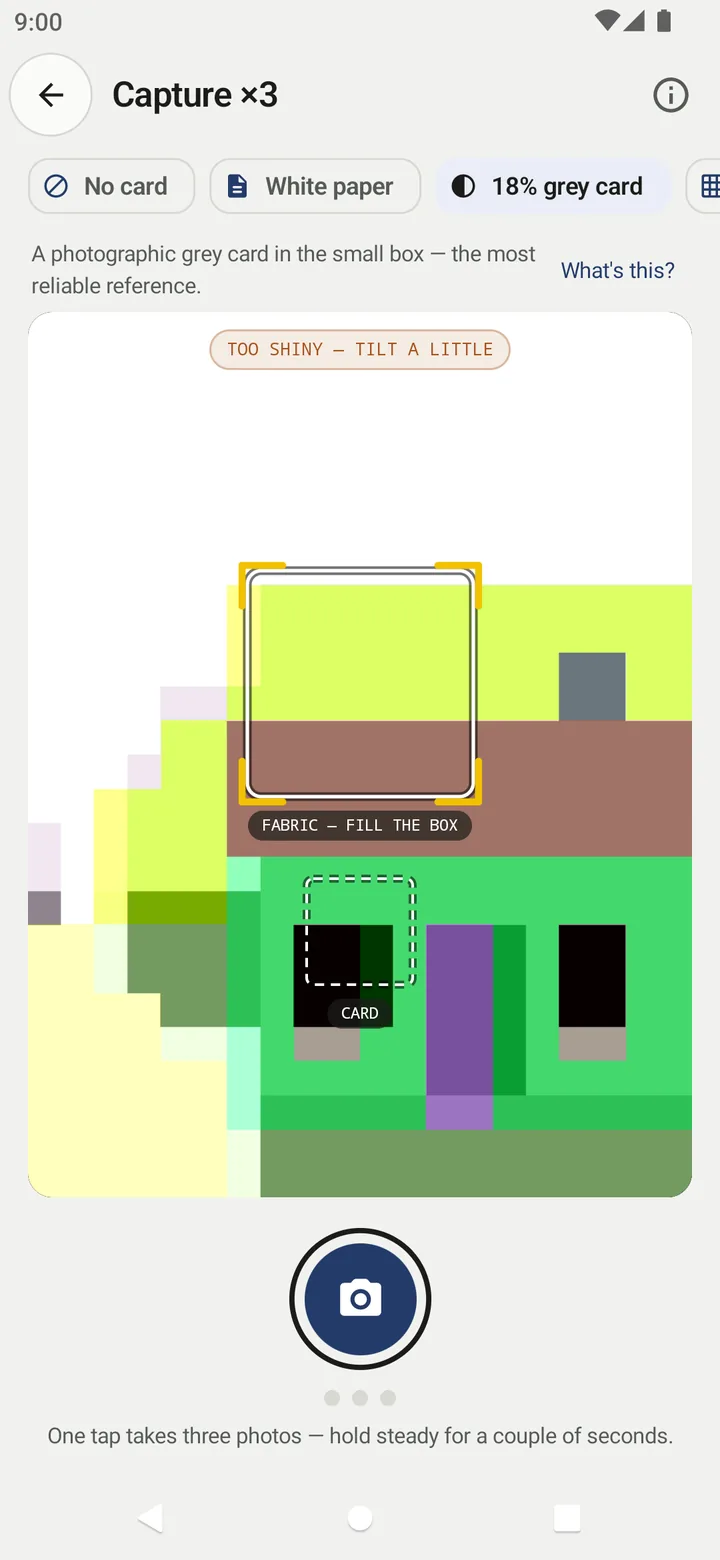
| 18% grey card | A photographic grey card in the small box | Same correction as paper, on a surface made to be neutral – the most reliable card |
| Color chart | A 24-patch ColorChecker-class chart in the wide grid box | Reads all 24 known colours and computes a full colour correction |
White paper – the everyday choice
Any plain white printer paper works. The app treats the paper as bright white and scales each colour channel so the paper comes out neutral, which also sets the fabric's lightness. Because paper is always at hand, this is the default.
Paper is not made to a colour standard, so a slightly cream or bluish sheet shifts the reading a little. Use clean, matt, bright white paper and keep using the same kind.
18% grey card – the reliable one
A photographic grey card is manufactured to be neutral. It works exactly like paper, but you know the reference is right. Grey also sits closer to mid-tone fabrics, so it is less likely to be overexposed in bright light.
Color chart – the most accurate option
With Color chart selected, the overlay changes to a wide 6 × 4 grid. Fill it with a 24-patch ColorChecker-class chart, flat and evenly lit, with the dark-skin (dark brown) patch at the top left. A pill at the top reports align the chart until the chart fits, then shows the fit, for example chart fit ΔE 2.1.
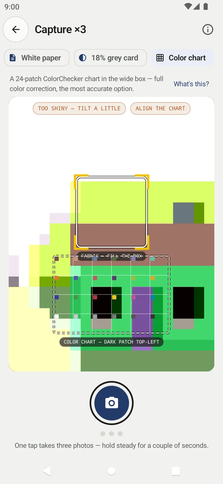
On the result, the app reports Chart correction: tight fit. or Chart correction: loose fit — see notes. If the chart cannot be read in two of the three photos, the capture is rejected with advice to refill the box and retake.
Placing the reference correctly
- Lay the garment flat near a window, in soft daylight and out of direct sun.
- Put the paper or card flat inside the small dashed box, touching the fabric.
- Make sure the card is in the same light as the fabric – a card in shadow corrects with the wrong answer.
- Fill the big box with plain fabric and tap the shutter once.
If the reference is too bright, the capture is rejected with The reference card is overexposed. Move out of direct light and try again.
Which one should I use?
- Everyday matching: white paper.
- When repeatability matters (the same job measured over several days, or by several people): an 18% grey card, used the same way each time.
- Tightest correction: the colour chart, if you have one.
- Just checking the family (is this a warm or cool grey?): No card is fine.
Related
Frequently asked questions
Can I use any white paper?
Use plain white printer paper, flat and clean, in the same light as the fabric. Avoid glossy, tinted, lined or crumpled paper.
Where do I get an 18% grey card?
Photographic grey cards are sold by camera shops and photo suppliers. They are made to be neutral, which is why the app calls them the most reliable card.
Which way round does the colour chart go?
Fill the wide grid box with the chart, flat and evenly lit, with the dark-skin (dark brown) patch at the top left.
Why do I get no recipe with No card?
Without something of known colour in the frame the app has to trust the camera's own colour guess, which is unverified. It names the colour family only.
Was this article helpful?
Related articles
- Lighting and framing for a good colour readingUse soft indirect daylight from one source, lay the fabric flat, fill the big box with plain cloth, tilt the phone about 30–45° and keep the reference card in the same light.
- Take your first fabric colour reading, step by stepTap Capture dress color, keep White paper selected, lay the paper in the small dashed box and fill the big box with flat fabric, then tap the shutter once and hold still.
- Why Shadecard shows no recipe (family only, no close match, whites)No recipe appears when there was no reference card (family only), when no library shade is within ΔE 9, or when the fabric is white or optically brightened. Each has a fix.
- Use the recipe calculator: grams, stock solution or pad liquorEnter fabric weight, depth (% owf), water ratio and the Y:R:B ratio. Pick Weigh (g), Stock (mL) or Pad (g/L); the calculator gives each dye plus bath volume, salt and soda.
Need a hand?
Email us what you see on screen — a screenshot helps — and we'll walk you through it.