Find and compare the nearest shades to your fabric
In short
Every result lists the top match and two runners-up; tap one to swap. On any shade, the Visually similar list and Compare show the ΔE00 and ΔL*, Δa*, Δb*, ΔC* side by side.
On this page
Shadecard never gives you just one answer. Every result lists the nearest shade plus two runners-up under Also worth a look — tap to swap, and you can open Compare side by side to see exactly how your fabric differs from the shade. In the library, each shade's page lists its four Visually similar neighbours with a Compare button for each.
Swap to a runner-up on the result
Borderline readings happen: two library shades can sit almost equally close to your cloth. The result shows the two alternatives with a word for how close each is (for example close match or decent match).
- Scroll the result to Also worth a look — tap to swap.
- Tap a runner-up. It becomes the main match: the name, verdict, meter, Starting recipe and tuning tips all update.
- Tap the original shade in the same list to swap back.
Reasons to swap: the runner-up's recipe is one your dye house already runs, its name matches what the buyer calls the colour, or the Light check shows the top match is light-sensitive (the app then suggests considering the next candidate).
Compare your fabric with the shade
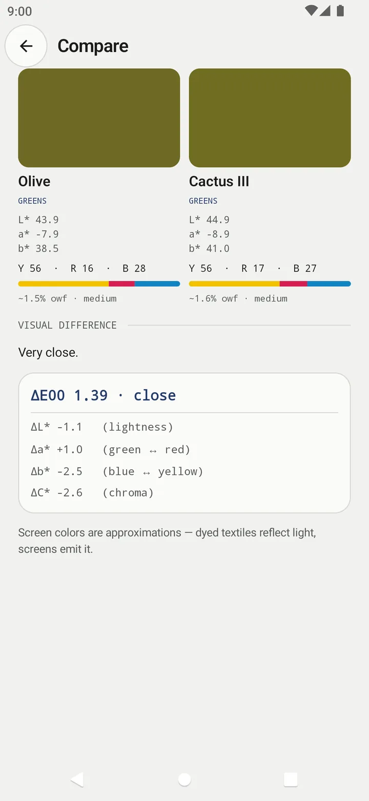
Tap Compare side by side near the bottom of the result. The Compare screen puts Measured (your capture) next to the shade, with each one's L*, a*, b*, ratio and depth, then a Visual difference verdict and the breakdown:
Each Δ is the left colour minus the right one – on a result, your fabric minus the shade:
| Line | Positive means the left colour is… | Negative means… |
|---|---|---|
| ΔL* (lightness) | lighter | darker |
| Δa* (green ↔ red) | redder | greener |
| Δb* (blue ↔ yellow) | yellower | bluer |
| ΔC* (chroma) | more vivid | duller |
The verdict words follow the overall ΔE00: Virtually identical (under 1), Very close (under 2.5), Similar, but distinguishable side by side (under 5), Noticeably different (under 9), Clearly different (9 and above). When the lightness or chroma gap is large, it adds a plain sentence such as …is lighter and softer than…. When you compare your own capture, a section headed From [shade] toward your fabric repeats the tuning tips.
Visually similar shades in the library
Open any shade from the Shade library (or from your favourites). Under Visually similar you get the four nearest library shades, each with its ΔE00 and a quality word (excellent, close, fair, far). Tap a name to open that shade, or tap Compare to see the two side by side.
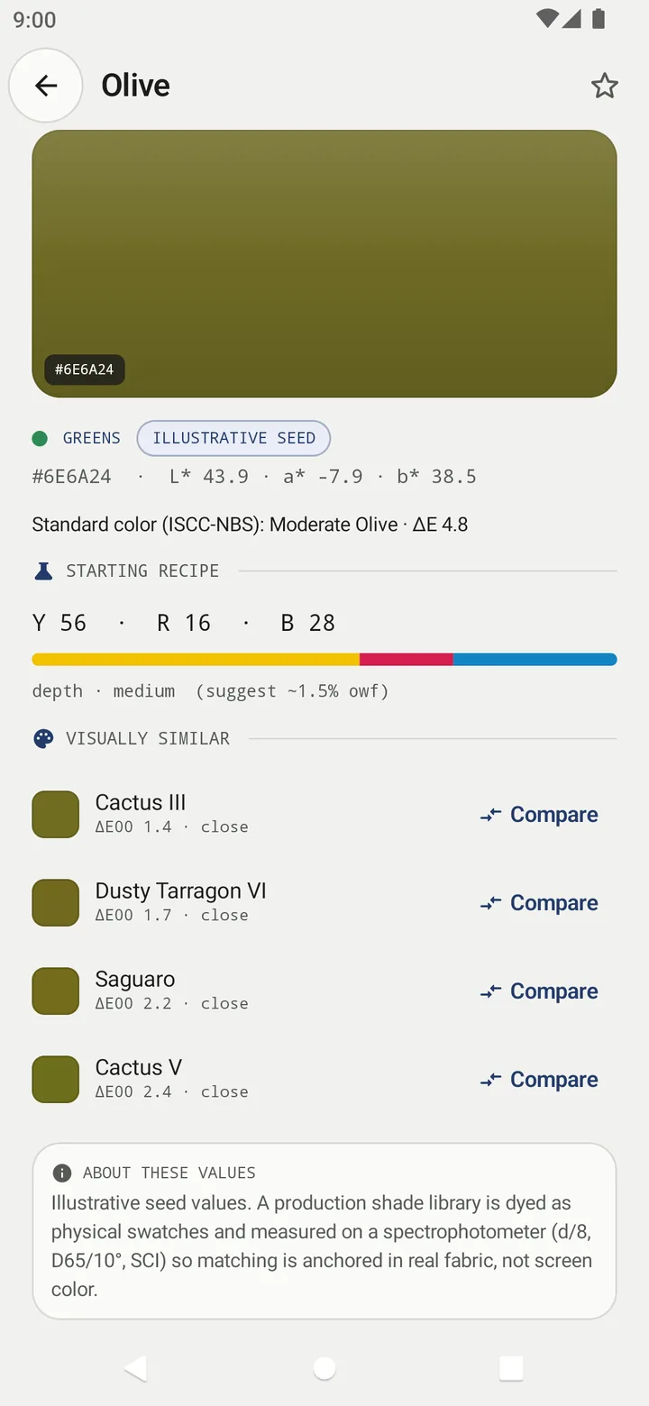
With 13,297 shades packed at least 1.3 ΔE00 apart, close neighbours are normal. Numbered variants such as Cactus III and Cactus V are separate library points near each other, each with its own ratio.
Which numbers to trust
- The ratio differences between neighbours are small – for example Y 56 · R 16 · B 28 against Y 56 · R 17 · B 27. That is about the size of a lab-dip correction.
- Library values are illustrative. The shade page says so under ABOUT THESE VALUES: the colours are not dyed swatches measured on a spectrophotometer.
- Your screen is not the cloth. Judge the final colour on the dyed dip in daylight, not on the phone.
Related
Frequently asked questions
Why would I pick a runner-up instead of the top match?
When two shades are only a little apart, the one whose recipe or name you already use may be the better start, or the light check may show the top match is light-sensitive.
Why do Visually similar and the result use different ΔE numbers?
Matching your fabric uses ΔE2000 with 2:1 lightness weighting, so depth matters less. Visually similar and Compare use plain ΔE2000 (1:1), the true visual difference between two shades.
Are the swatch colours on screen exact?
No. The app says so on the Compare screen: screen colours are approximations, because dyed textiles reflect light and screens emit it.
Was this article helpful?
Related articles
- Read your result: L*a*b*, shot spread, ΔE00 match and depthThe result shows your fabric's L*a*b*, how well the three photos agreed (spread), how close the nearest shade is (ΔE00), a Y:R:B starting recipe and a depth in % owf.
- Browse and search the 13,297-shade Shadecard libraryOpen Shade library from the home screen, filter by one of six families or type a shade name. Type a six-digit hex code to see the nearest fine-grid points with derived recipes.
- Shadecard explained: what it does and who it is forShadecard measures a fabric's colour with a phone camera, matches it to a library of 13,297 shades and gives a yellow:red:blue starting recipe to confirm with a lab dip.
- Take your first fabric colour reading, step by stepTap Capture dress color, keep White paper selected, lay the paper in the small dashed box and fill the big box with flat fabric, then tap the shutter once and hold still.
Need a hand?
Email us what you see on screen — a screenshot helps — and we'll walk you through it.